Amazon Web Services
Driving a 32% Conversion Rate Across 150+ Event Landing Pages By Building A Coherent & Scalable Design System
Client
Amazon Web Services
Role
Web Designer (Agency)
Year
2025-26
TL;DR
Designed a scalable landing page system for AWS Partner Program driving a 32% conversion rate across 150+ regional partner events. Built a component-based code and design framework using behavioral design principles and strategic information architecture that reduced page production time for the team by 60% while maintaining conversion effectiveness. The system cut form abandonment and improved registration-to-attendance ratios, proving better lead quality through clearer value communication.


The Context
Utilising design for corporate events
How might we create a scalable landing page system that converts prospects into registered attendees while adapting to diverse event types, audiences, and regional requirements?
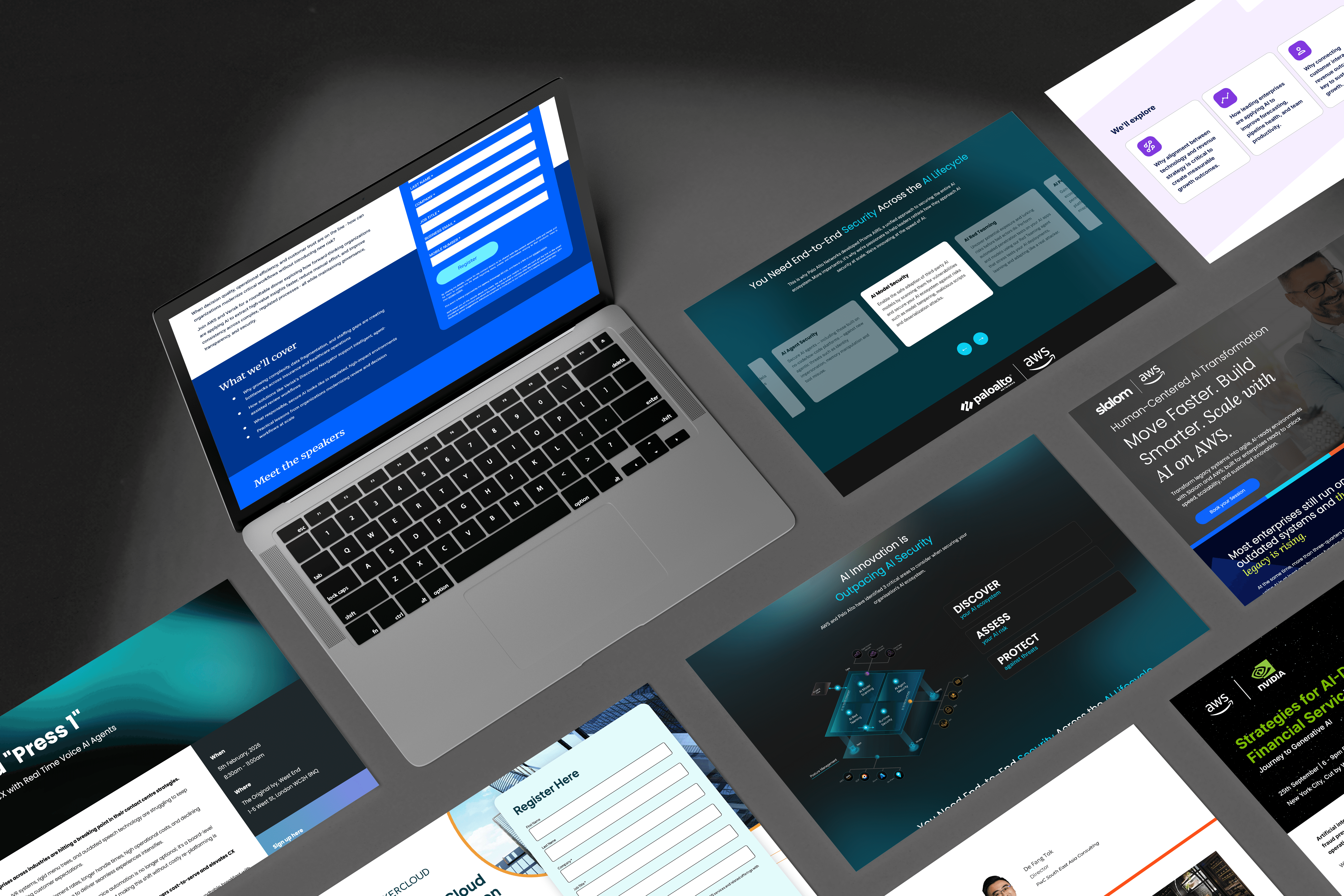
The tension: build 150+ unique pages that feel tailored to each event while maintaining partner brand consistency and production efficiency. Every page needed to work harder, balancing information depth with conversion-focused simplicity.
The Challenge
The existing approach had its problems…
Information overload and barriers were killing conversion. Users needed depth to make informed decisions, but every additional detail increased cognitive load and pushed CTAs further down the page. The existing templates tried to solve this by cramming everything above the fold; resulting in cluttered, overwhelming experiences that converted poorly.
The Research
Building foundations for a new user experience
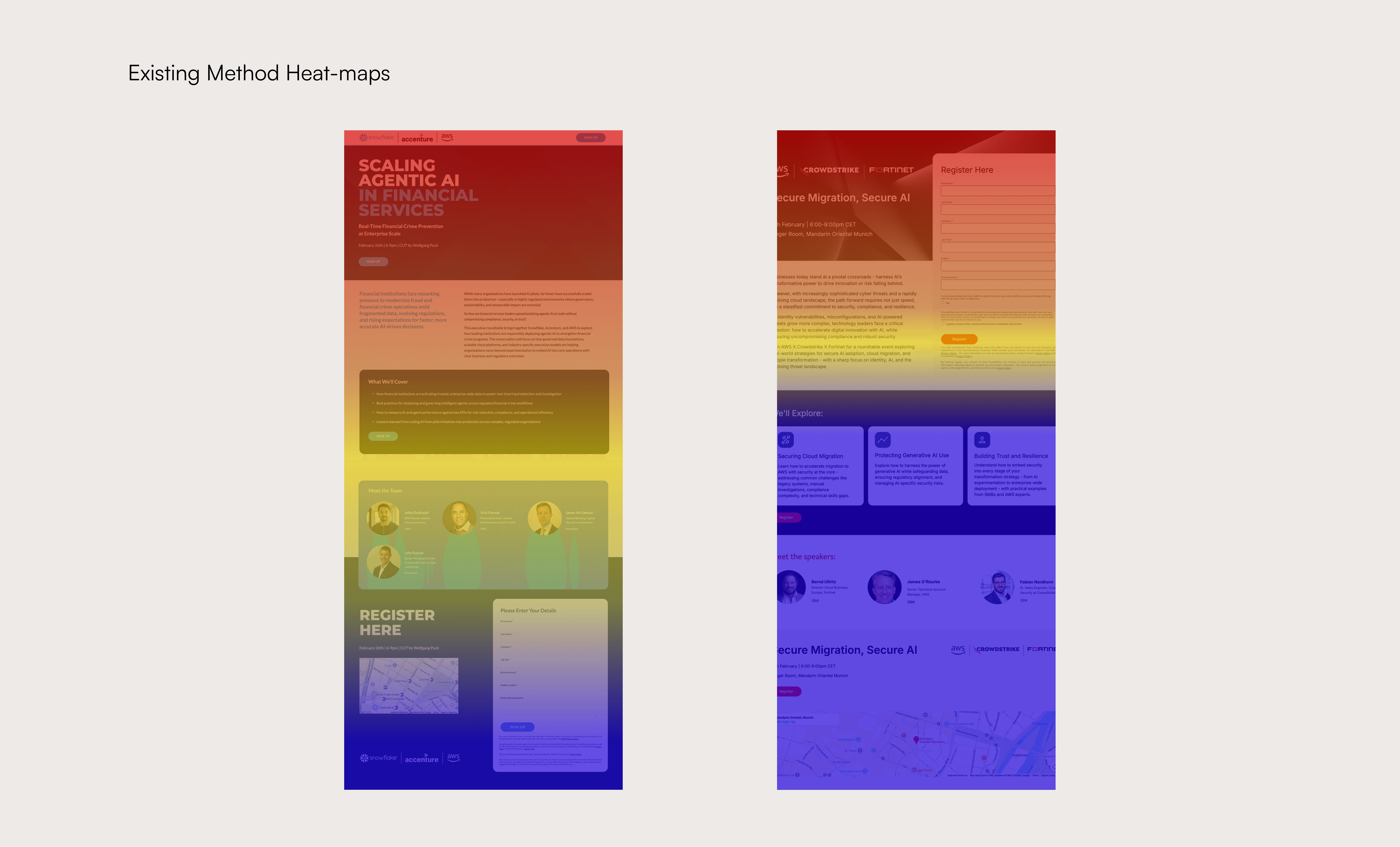
Behavioral analysis through heat mapping and analytics metrics revealed four critical friction points in the initial framework's user journey:
Users couldn't assess event value quickly
Dense hero sections failed the 5-second test, users couldn't determine if an event was relevant to them without scrolling multiple sections.
Registration forms created barriers
Long field forms included redundant data points that AWS already had access to through partner accounts. Drop-off rates spiked at form entry.
Social proof was disconnected
It was imperative that participating company logos were adjacent to CTAs where conformity bias could initiate action.
Competitive audit
High-converting event pages showed consistent patterns: benefit-driven headlines, progressive information disclosure, and repetition of CTAs.
The Solution
Testing & Validation
Was this new approach going to work?
A/B tested CTA copy, placement, and visual weight across 30+ initial pages before system-wide rollout. "Register Now" outperformed "Save Your Spot" by 12%. Primary button CTAs above the fold plus a secondary CTA after agenda details converted 18% better than single placements.
Rapid prototyping with real event data validated each pattern against conversion benchmarks. Iterated hero section layouts through multiple template versions before finding the optimal balance of visual hierarchy and information density.
Heat map analysis post-launch confirmed users were engaging with key decision-making content (agenda, speakers, logistics) before converting, validating that information architecture was working as designed.
The Outcome
Design Principles in Action
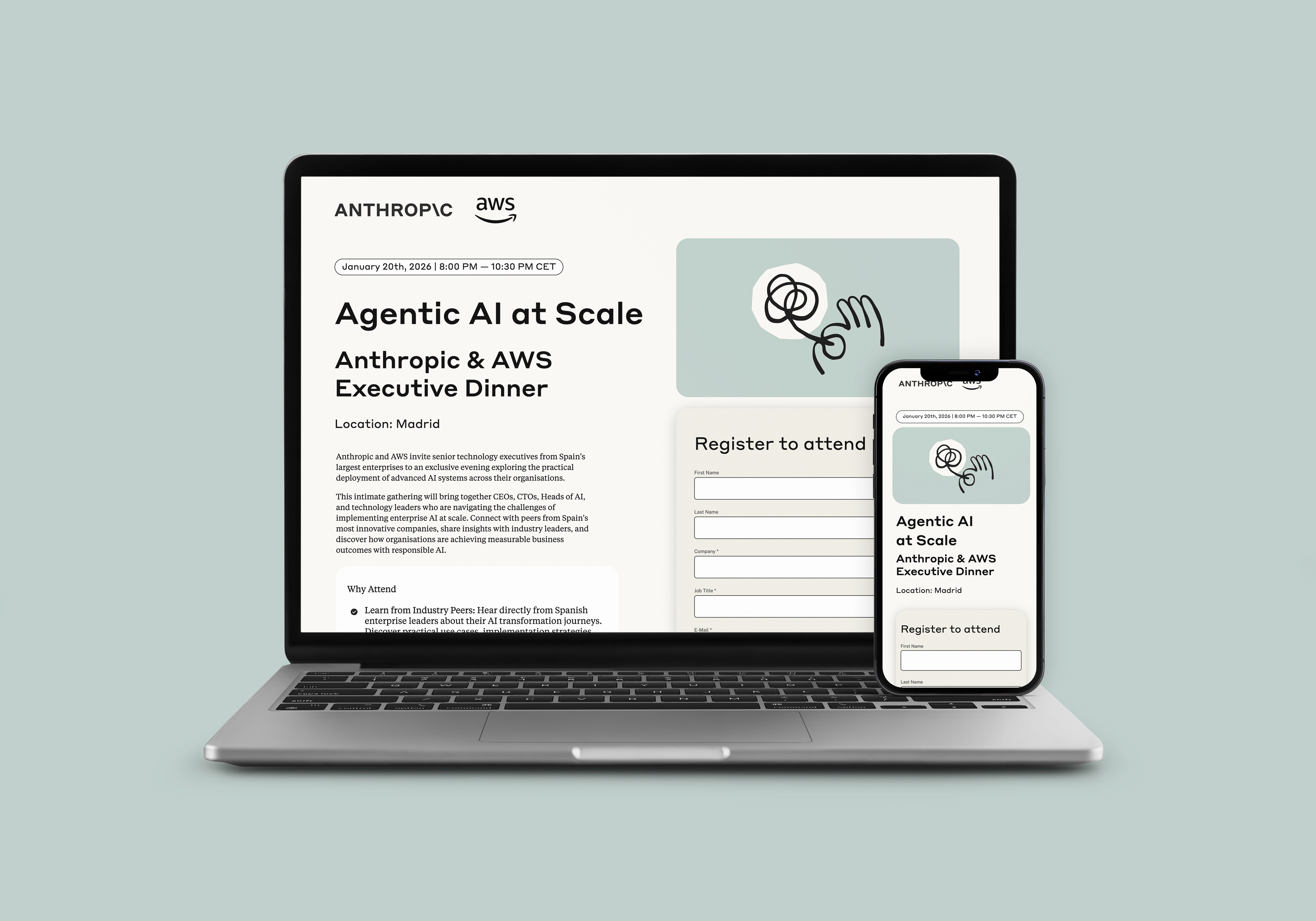
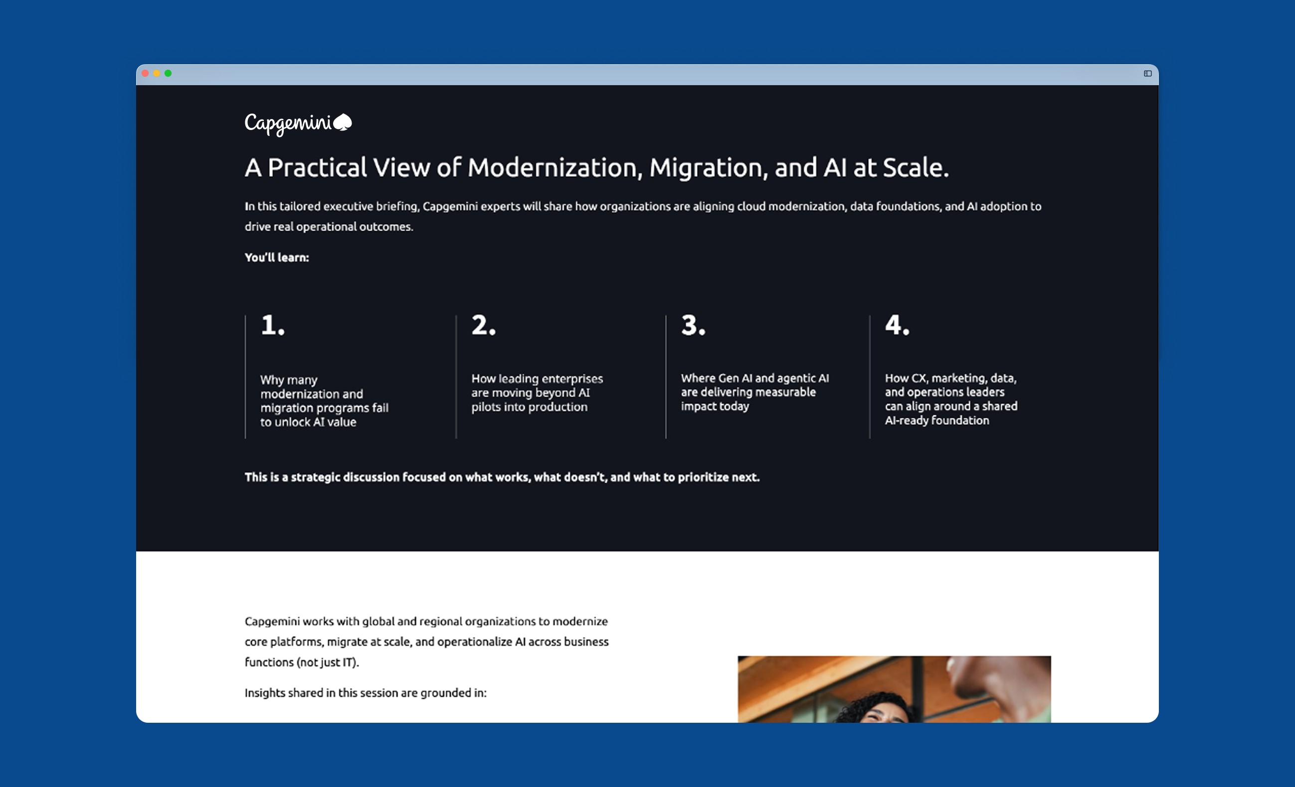
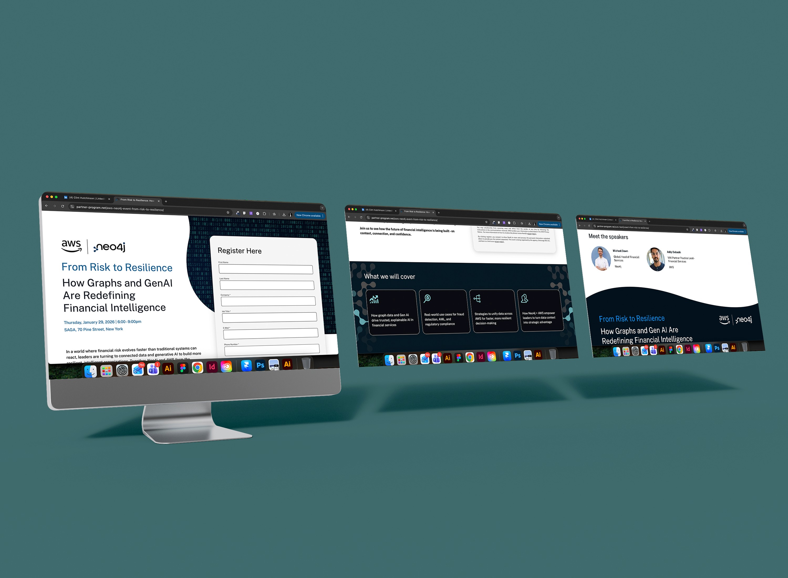
Value Hierarchy Restructure
Replaced feature-heavy descriptions with benefit-driven headlines that answered "what's in it for me" in under 5 seconds. Additionally ensured page architecture followed natural reading flow patterns when creating wireframes.
Why it worked: Users could self-qualify faster, reducing bounce rates among irrelevant traffic while increasing engagement from qualified prospects.
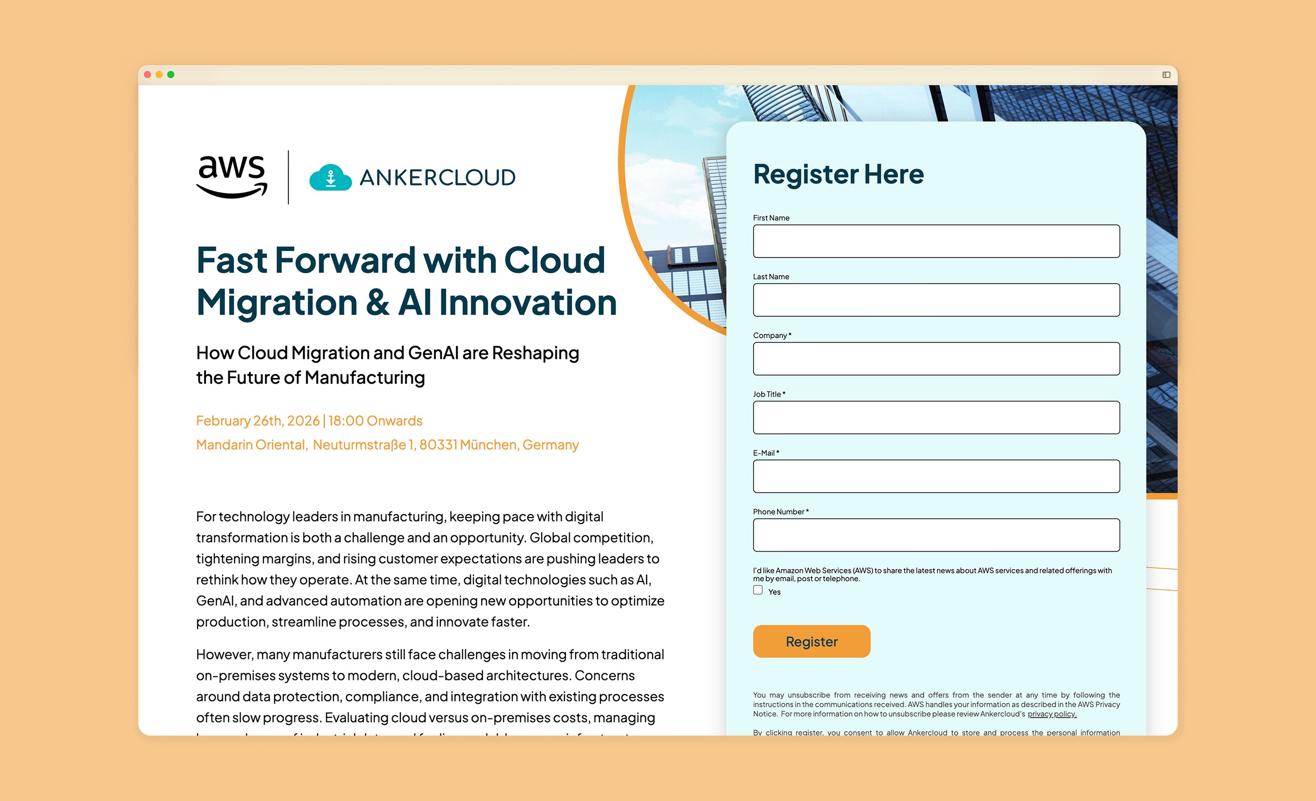
Form Field Reduction
Stripped registration to name, email, company, and role. Removed redundant fields like address and phone by leveraging existing AWS partner account data.
Why it worked: Form abandonment dropped. Less friction meant more completions. The data AWS and Partners actually needed was captured; everything else was noise.
Strategic Social Proof Placement
Positioned attendee counts and recognizable company logos directly adjacent to CTAs, leveraging conformity bias at the moment of decision.
Why it worked: "500+ partners registered" next to a CTA button creates urgency and validation simultaneously. Footer placements achieved neither.
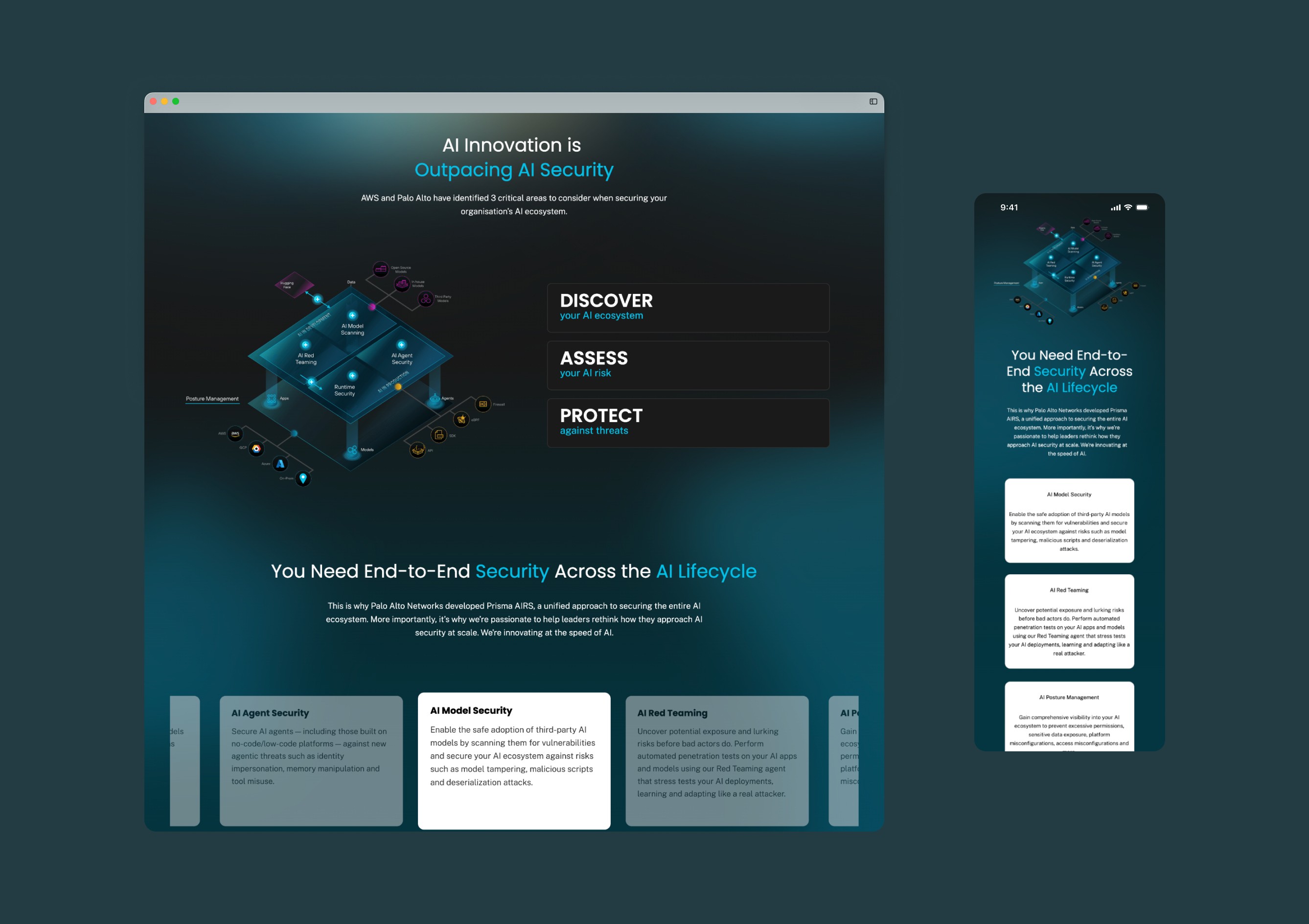
Component-Based System Architecture
Applied atomic design principles to build modular hero sections, agenda blocks, speaker cards, and social proof units that could flex across event types while maintaining psychological effectiveness.
Why it worked: Production velocity increased 3x. New pages could be assembled in hours instead of days, with conversion patterns baked into every component—not applied as afterthoughts.
The Outcomes
The impact in numbers
27% average conversion rate across 100+ pages.
34% decrease in form abandonment rates.
Established a 'Code Directory' with custom components for colleagues to access to increase page production time .
78% of users engaged with key content before converting, confirming information hierarchy effectiveness.


